What is the Pareto chart?
- Pareto chart is a very simple but useful tool that can be very useful in quality control. It is one of the major six sigma tools.
- In the 19th century, economist Vilfredo Pareto stated that about 80% of the century’s wealth is occupied by 20% population. This famous observation was later named as the “80-20” rule.
- This theory can be applied to quality control also, where it can be stated that 20% of causes are responsible for 80% of problems.
- Although these are not a strict numerical value. The numbers can be 25-75 or 15-85. In a generalized way, it can be said that few causes are responsible for many problems.
When to use a Pareto chart?
- When analyzing data about the frequency of the problems or causes of the processes.
- When there are many problems or causes and the quality analyst wants to focus on the most significant.
- When analyzing broad causes by looking at their specific components.
- When analyzing the characteristics of the shop, or production process.
Analysis of Pareto chart with examples:
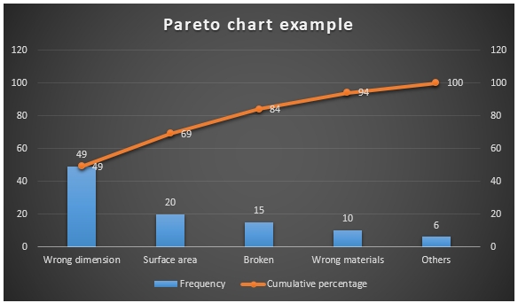
A simple example of Pareto chart:
How to draw a Pareto chart?
 |
| Table of data |
 |
For analysis only this two columns will be needed
|
- After getting data, at first arrange the frequency in descending order. Then start placing the values in the chart.
- Then follow the below steps:
In Microsoft Word:
- Choose series one as cluster column and series two as line.
- Insert data (In the first column enter frequency and the second column enter cumulative percentage).
In Microsoft excel:
- Go to Microsoft Excel and enter all the data (First enter the name of the problems then in the second column, enter the frequency and in the third column enter cumulative percentage).
- Select the data and go to insert.
- Select the second option (line on the secondary axis).
How to read a Pareto chart?
- In the horizontal axis, the name of the problems is placed.
- In the right and left vertical axis, numbers from 0 – 100 is placed.
- The bar chart shows the frequency of problems.
- The line shows the cumulative percentage value.
- From the chart, we can see that 83% of issues are caused by the first 3 problems. So as we can see it has supported the 80-20 rule.
Explanation of some real-life Pareto chart example:
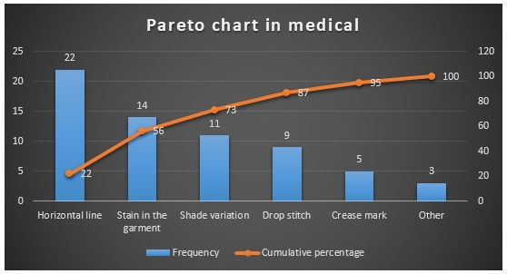
1. Pareto chart example in medical/hospital:
- At first, the raw data frequency is arranged in descending order.
 |
| Table of data |
From here, we can see that the first two causes are the reasons for 61% problem. If we can fix these two sections, then we shall be able to solve 61% problem.
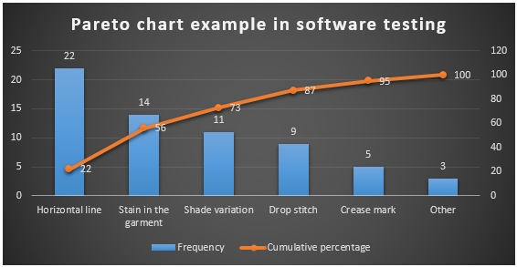
2. Pareto chart example in software testing:
- At first, the raw data frequency is arranged in descending order.
 |
| Table of data |
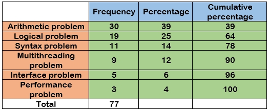
From here, we can see that the
first two causes are the reasons for 64% problem, first 3 causing 78% problem.
If we can fix these three sections, then we shall be able to solve 78% problem.
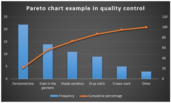
3. Pareto chart example in quality control in textile and apparel industry:
- At first, the raw data frequency is arranged in descending order.
 |
| Table of data |
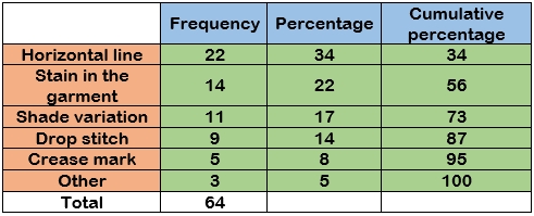
From here, we can see that the first two causes are the reasons for 56% problem, first 3 causing 73% problem. If we can fix these three sections, then we shall be able to solve 73% problem.
Conclusion:
Pareto chart is a powerful yet easy tool that can be used in different sectors for quality control. Through this too, we can easily identify the main reasons of the problems and solve them and ultimately the quality of the product and efficiency of the performance will improve.







0 Comments